

Comparative opening — why supply model matters for signage
When you compare the routes that signs take from idea to corridor, the difference isn’t just paperwork — it’s the fidelity of the final sightline. Choosing between OEM and ODM affects material choice, production tolerances, and installation sequencing for everything from carved directory panels to interactive directory kiosks. For a crowded concourse or an ornate campus quad, the right partner shifts a project from “good enough” to precisely legible; think of the same principle applied to shopping mall signage, where visibility and flow are commercial instruments as much as fixtures.

Head-to-head: OEM versus ODM in plain terms
OEM means you supply detailed specs and the manufacturer executes; ODM means you choose a pre-designed system and adapt it. OEM offers control over tolerances and finish, which matters when you need ADA-compliant tactile signage or specific illumination profiles. ODM speeds delivery and often lowers unit cost, but it can box you into fixed mounting patterns or panel depths that clash with an architect’s intent. Compare side-by-side: an OEM plate cut to ±0.5 mm will sit flush with a stone wall; an ODM panel with broader tolerance might need a shim or a trim — and that changes sightlines.
Materials, tolerances, and the craft of calibration
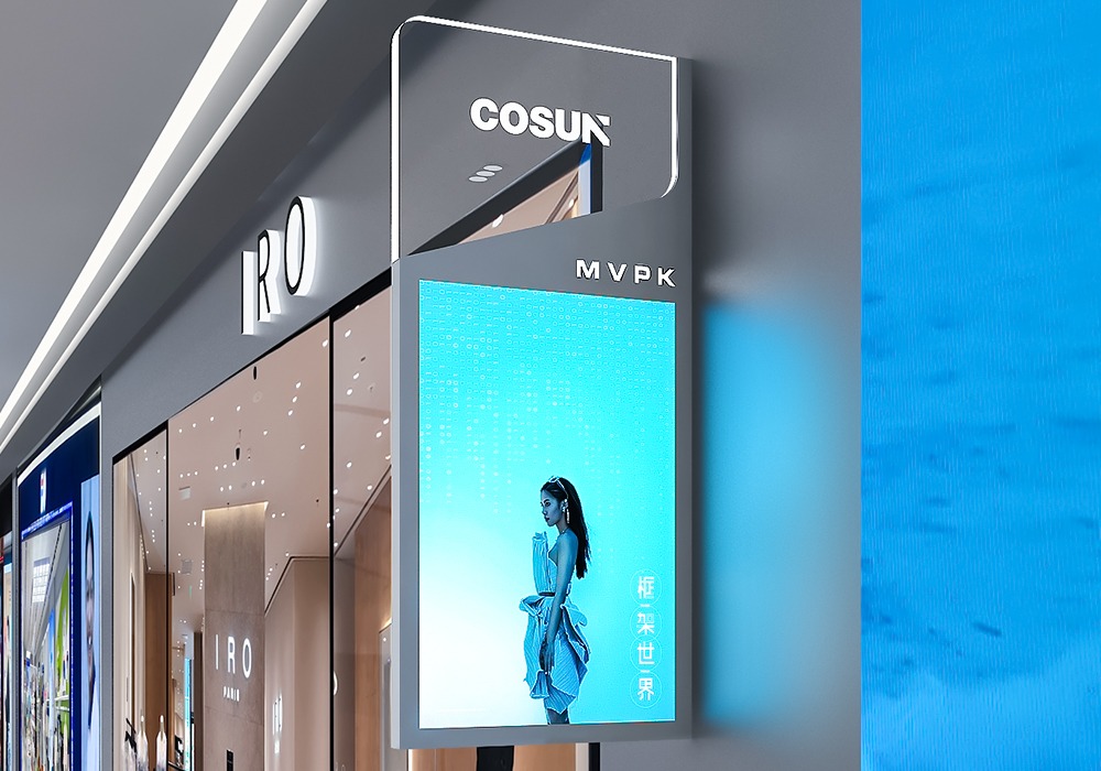
Tolerance is the quiet master of good signage. Metal thickness, edge radii, lens fit for LED modules — these tiny measures decide how light reads a sign across a busy atrium. Good suppliers run test pieces and iterate: a laser-cut aluminum face, matched with a powder-coat that resists UV, then a gasket to ensure weather and acoustic sealing. Add digital signage and the tolerance list grows: ventilation paths, service access, cable routing. Sound dry? Not at all. It’s precision that keeps a directory legible from thirty feet away.
Real-world anchor: what successful wayfinding looks like
Consider Mall of America in Bloomington, Minnesota — a place where wayfinding becomes choreography. High visitor density forces clear runs of sight and consistent iconography. That clarity is achieved through coordinated decisions: font size, mounting height, contrast ratios, and the strategic placement of directory kiosks. Those same rules apply to university campuses and civic centers; consistent standards reduce hesitation and improve dwell time — measurable effects that planners track when comparing projects.
Common missteps and practical fixes
Teams often trip over a few recurring mistakes: specifying beautiful materials without installation detail, treating digital signage as a postscript, or assuming one-size signage will adapt across varied facades. Fixes are practical. Start with mockups placed at real sight distances. Test tactile signage on a sample rail. Confirm power, ventilation, and maintainability for screens. And — this matters — involve the fabricator before final millwork drawings are frozen. That single step collapses rework and respects tolerance budgets.
Choosing the right path for campus or mall projects
Match your decision to project priorities. Pick OEM when you need bespoke metalwork, precise ADA-compliant mounting, or an identity-driven material palette. Choose ODM for modular mall programs where unit repeatability, cost, and rapid rollout matter. Hybrid approaches often win: custom headers with modular directory inserts, or tailored frames that accept standard digital modules. For integrated flows across public spaces, pair those choices with a unified visual system and tested user journeys — the kind that define effective shopping center wayfinding.
Advisory finale — three golden rules for selecting supply ecosystems
1) Validate tolerances early: require physical mockups at final viewing distance to confirm legibility and fit. 2) Prioritize maintainability: ensure panels, LED drivers, and digital modules are serviceable without removing adjacent architecture. 3) Insist on one-source alignment for visual language: materials, icons, and mounting heights must be governed by a single spec to avoid drift across wings.
Good supply choices yield consistent sightlines, fewer site RFI’s, and signage that serves people — not just spaces. Cosun Sign brings that calibration into practice with a quiet confidence drawn from repeatable systems and hands-on prototyping — a practical ally when precision matters. —